Honuka
Studio
Redfire
Role
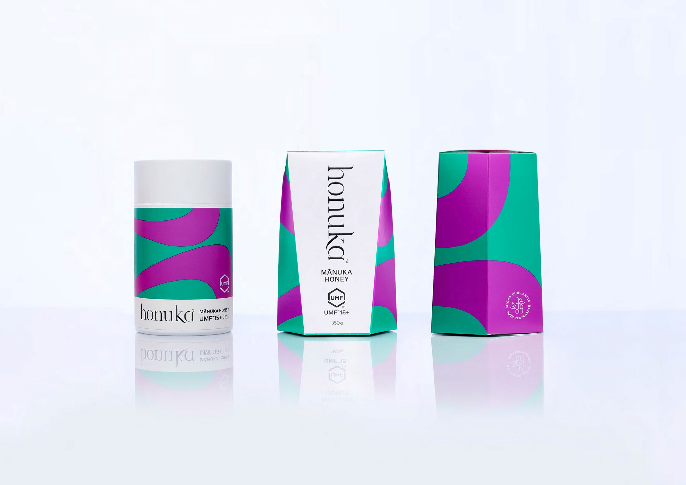
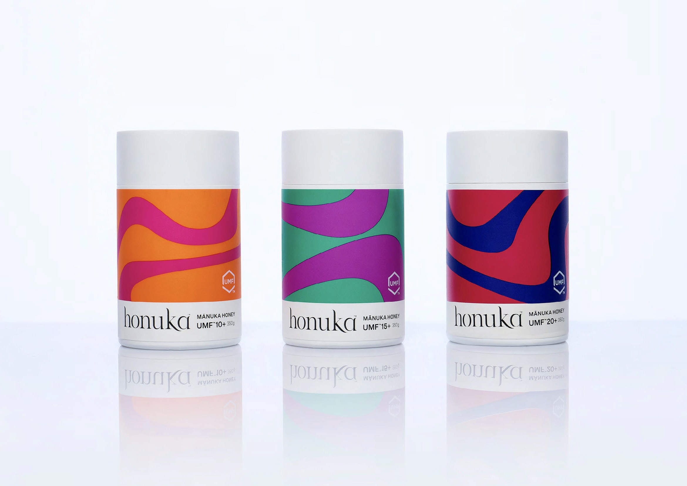
Brand Identity, Brand System, Packaging Design


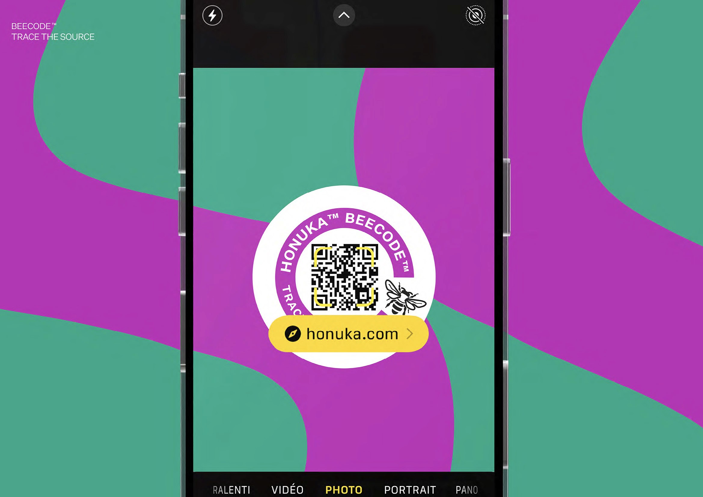
Challenge
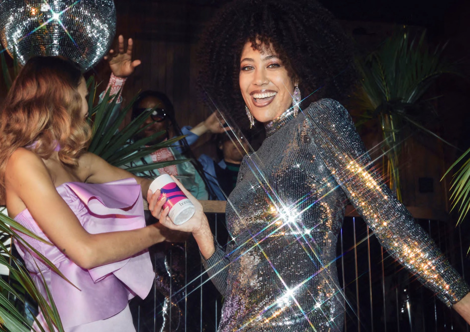
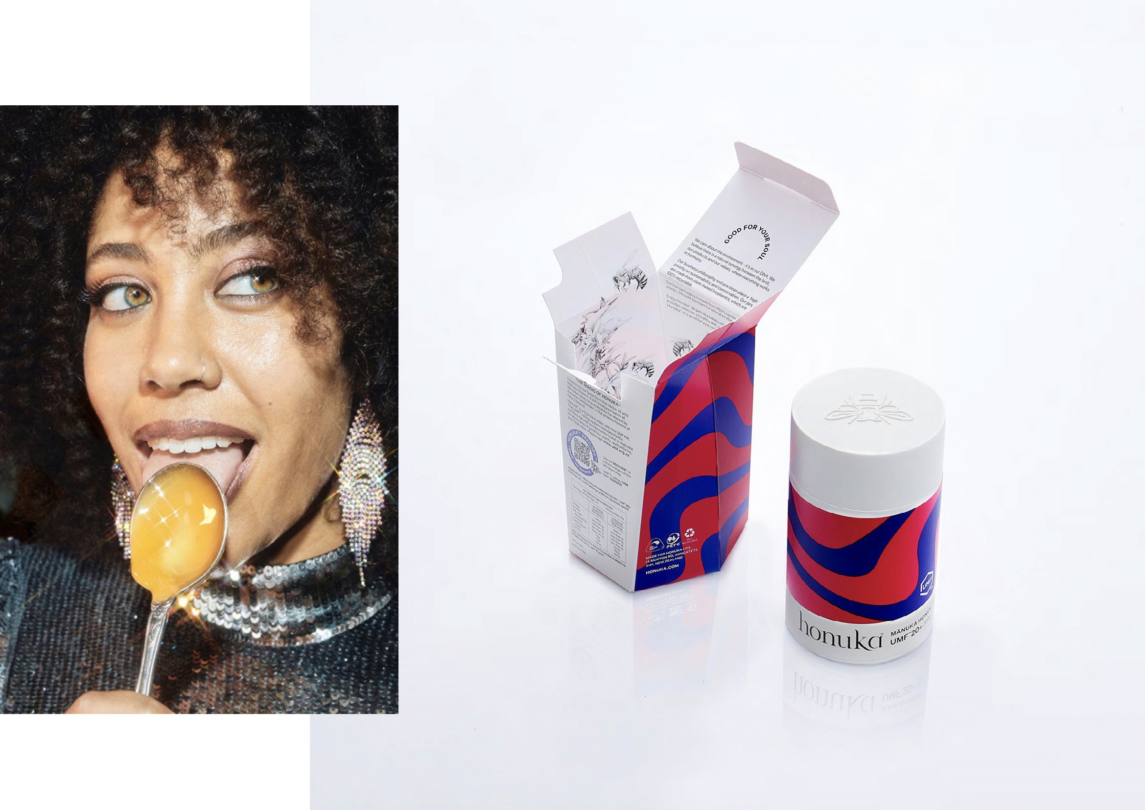
Establish a premium Mānuka honey brand that breaks from tired category conventions — signalling quality and provenance without resorting to the expected visual language, while making sustainability a structural commitment rather than a marketing afterthought.
Solution
Packaging built on restraint and intention. Vibrant, considered colour signals premium quality on its own terms. To hold Honuka is to enter a larger story — one that honours the relationship between bees, flowers, and the landscapes that sustain them. The design asks something of the consumer in return: to choose with care, and to recognise that what nourishes the earth also nourishes us.