Lords + Angels
Studio
Redfire
Role
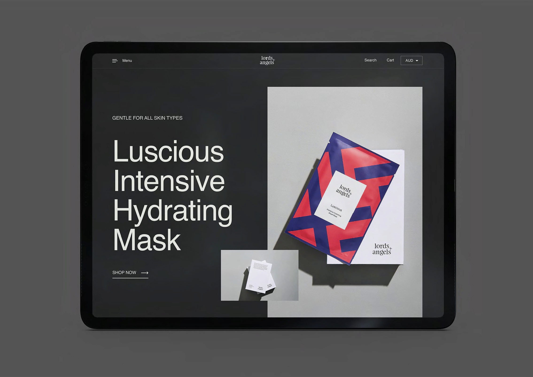
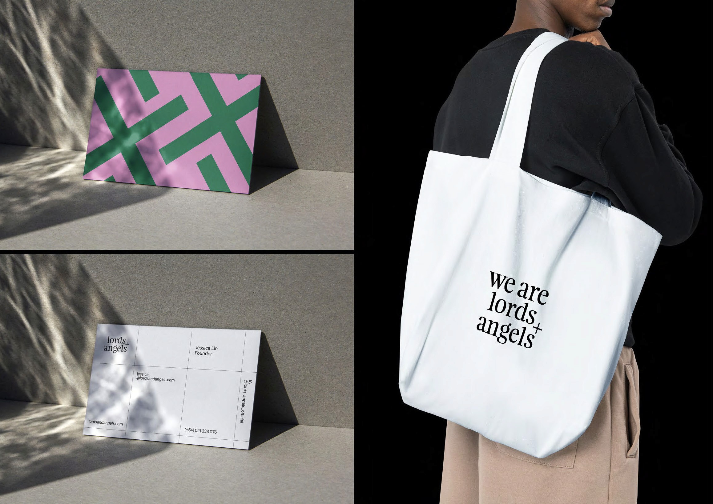
Brand Identity, Brand System, Packaging Design, Web Design, Code, Art Direction, Brand Collateral


Challenge
Create a premium beauty identity that holds genuine tension between heritage and scientific rigour — without collapsing into either the expected clinical aesthetic of science-led skincare or the soft romanticism of luxury beauty.
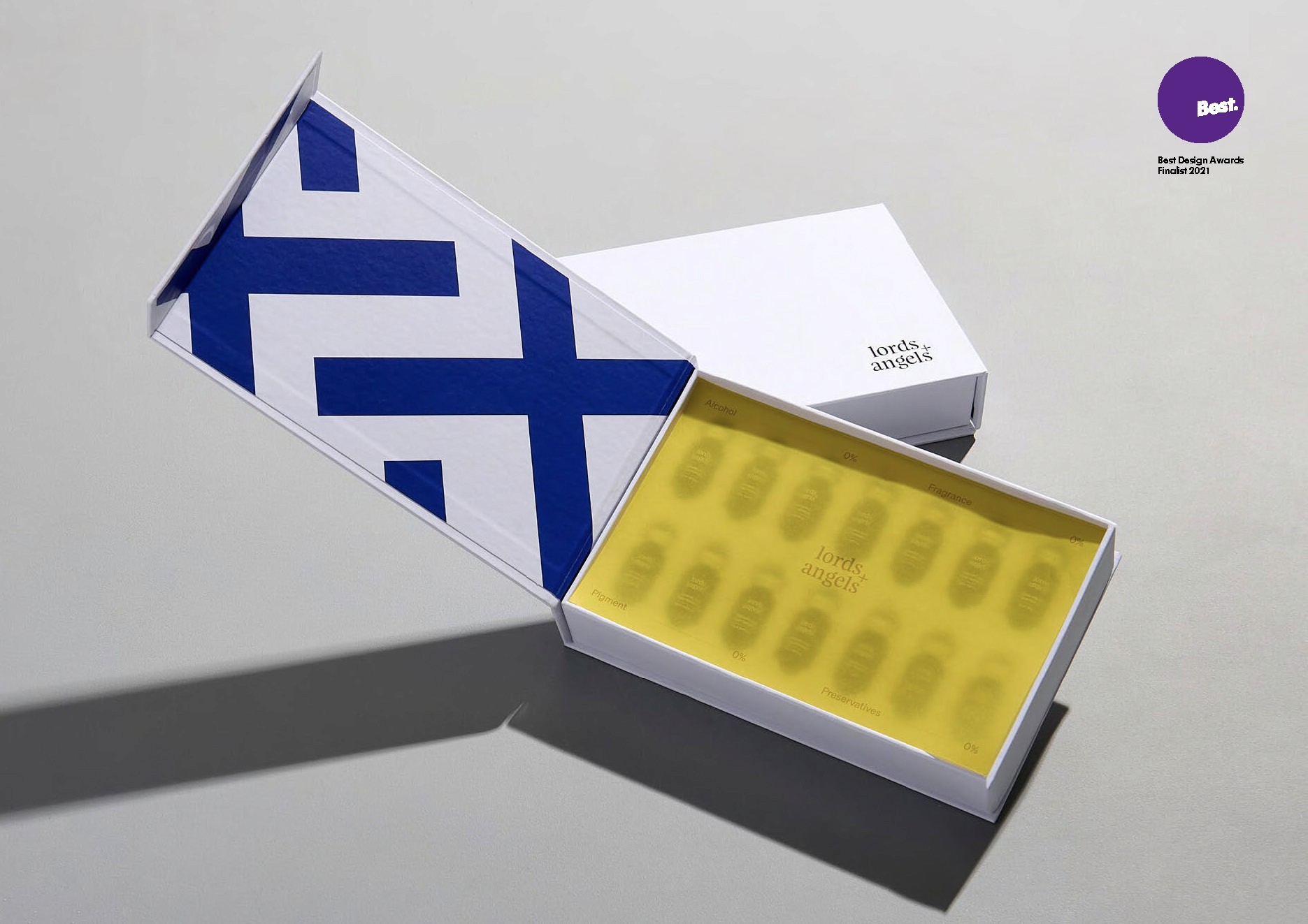
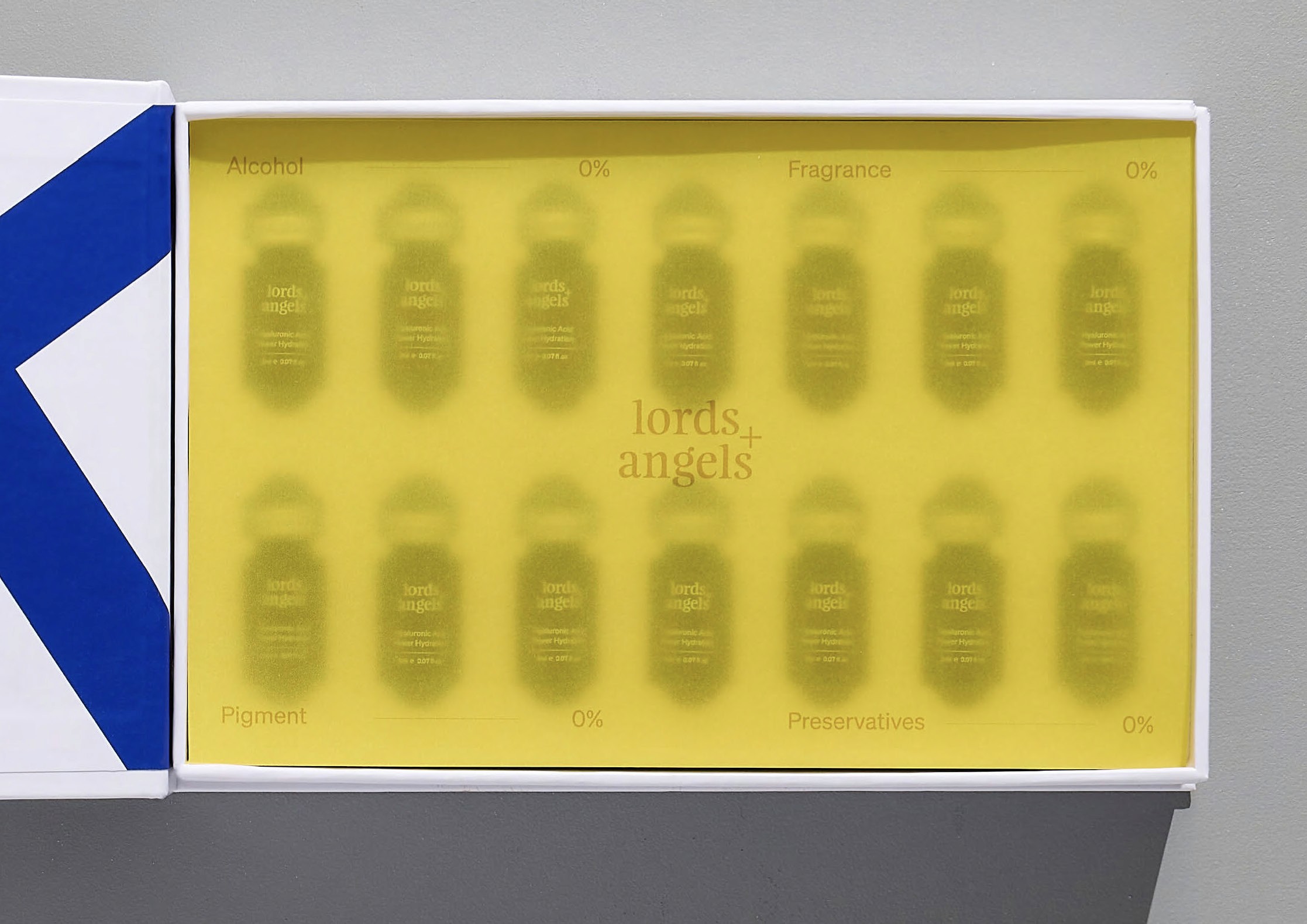
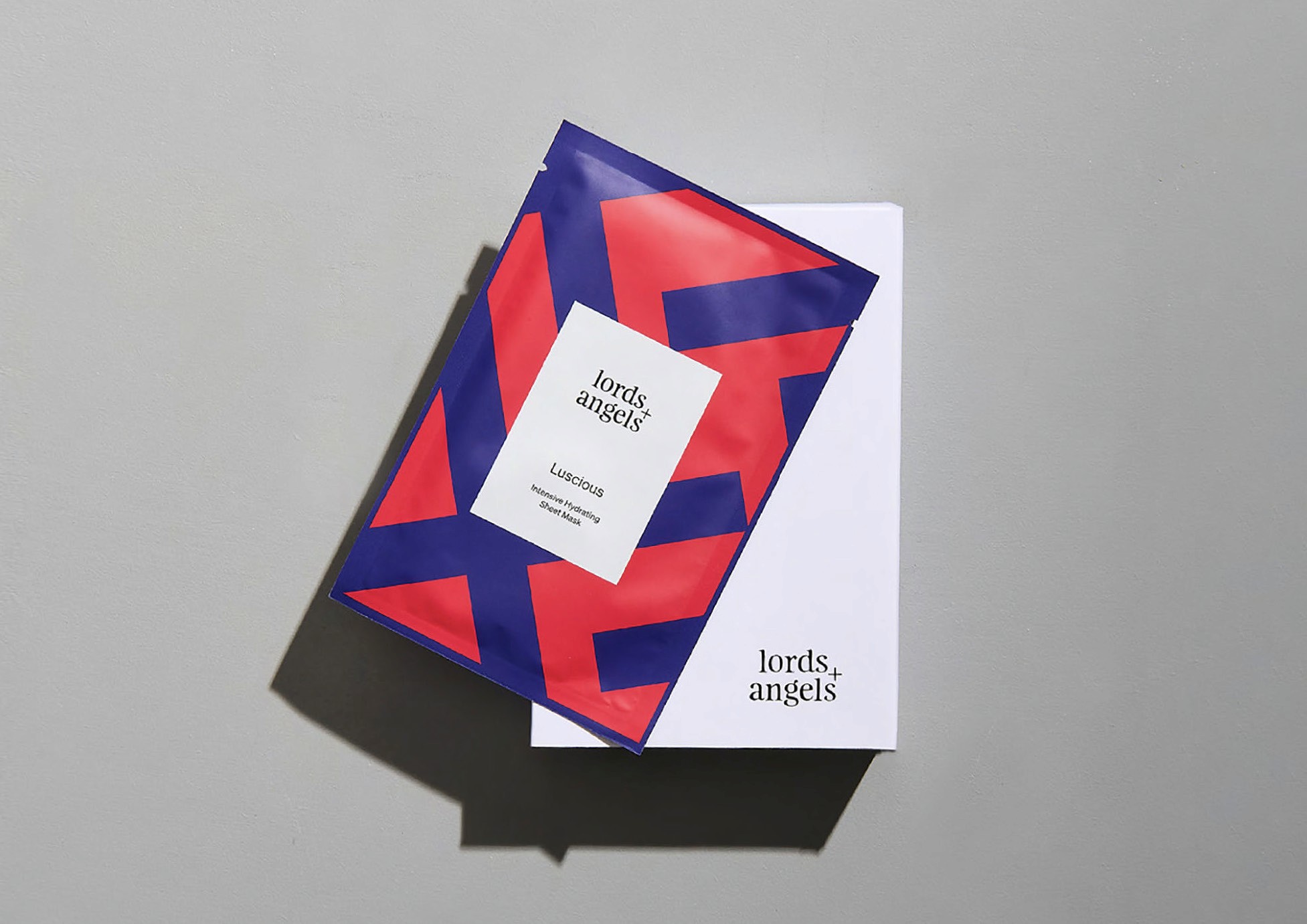
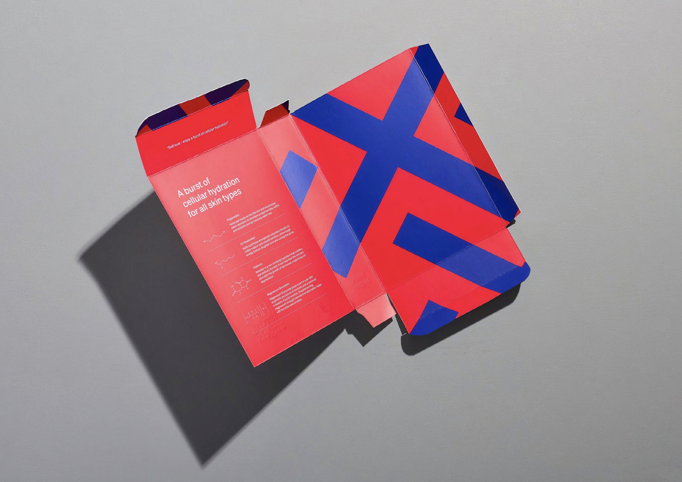
Solution
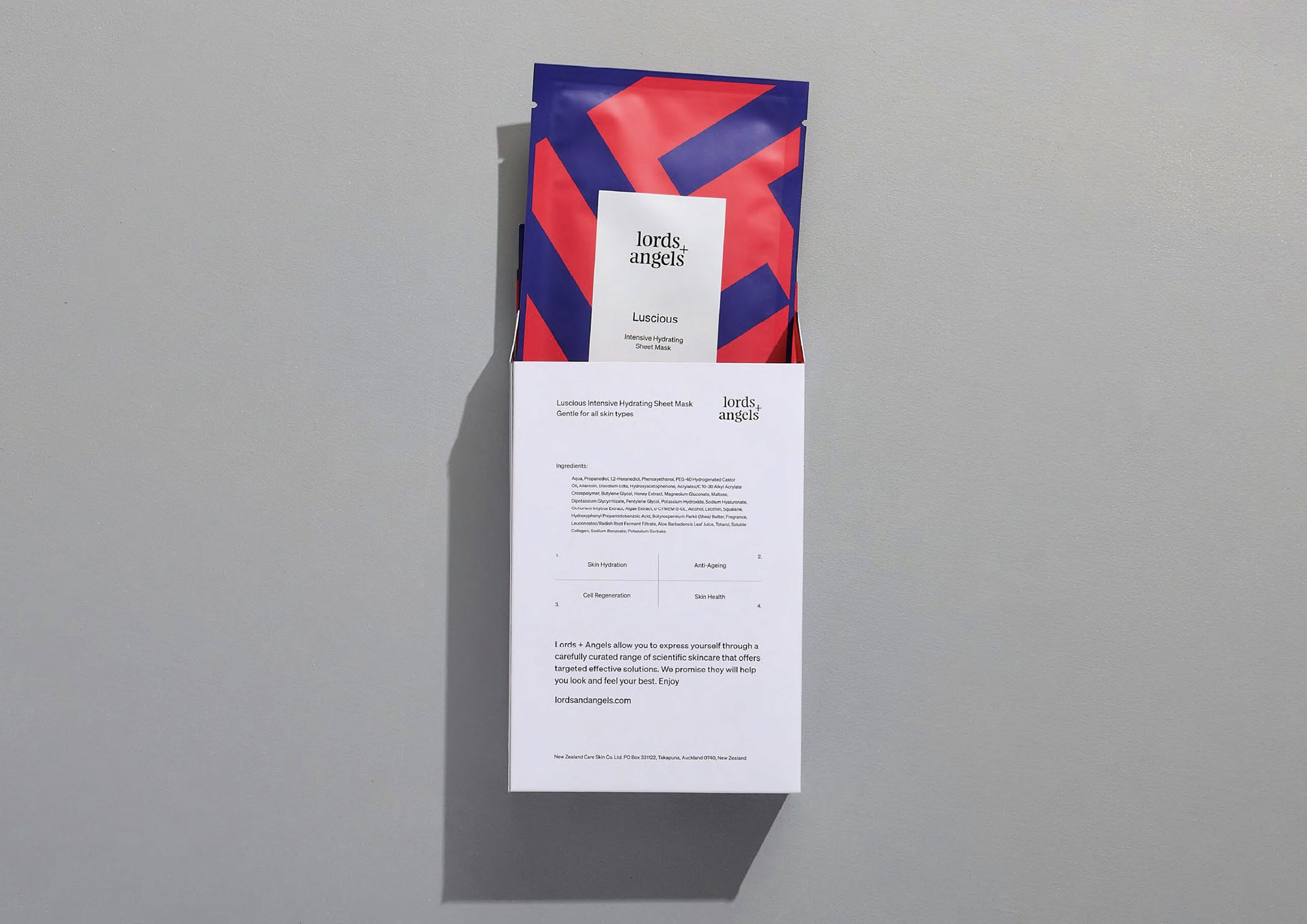
Feijoa and Söhne held in deliberate tension — heritage and rigour coexisting without compromise. A cross-hatch pattern from the + extends across all touchpoints, colour drawn from the saturated luminosity of stained glass. Packaging completes the story: clinical white outside, vivid colour within — an unexpected moment of joy that speaks to the brand's belief in the beauty within us all.