bh:
construction
Studio
Crave Group
Role
Brand Positioning, Brand identity, Brand System, Web Design, Brand Collateral, Outdoor, Merch


Challenge
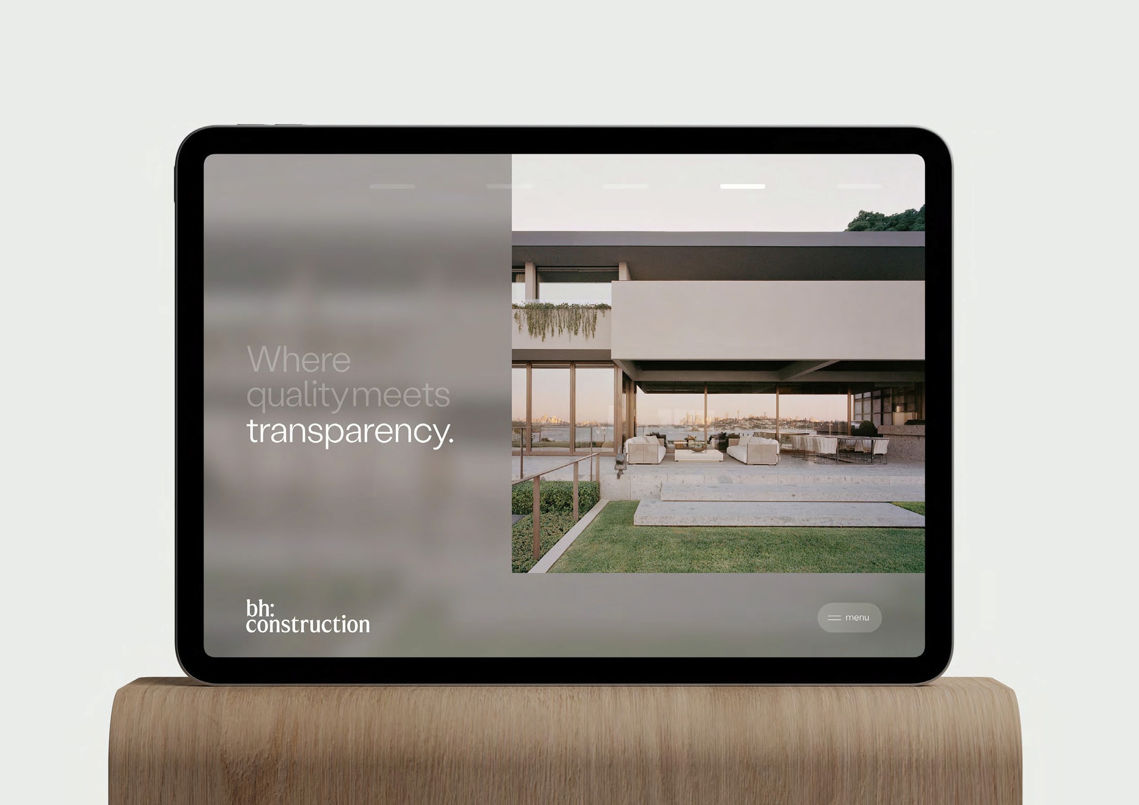
Position a construction company as a trusted partner for design professionals — communicating precision, transparency, and quality through a visual identity that speaks the same language as the architects and designers they work alongside.
Solution
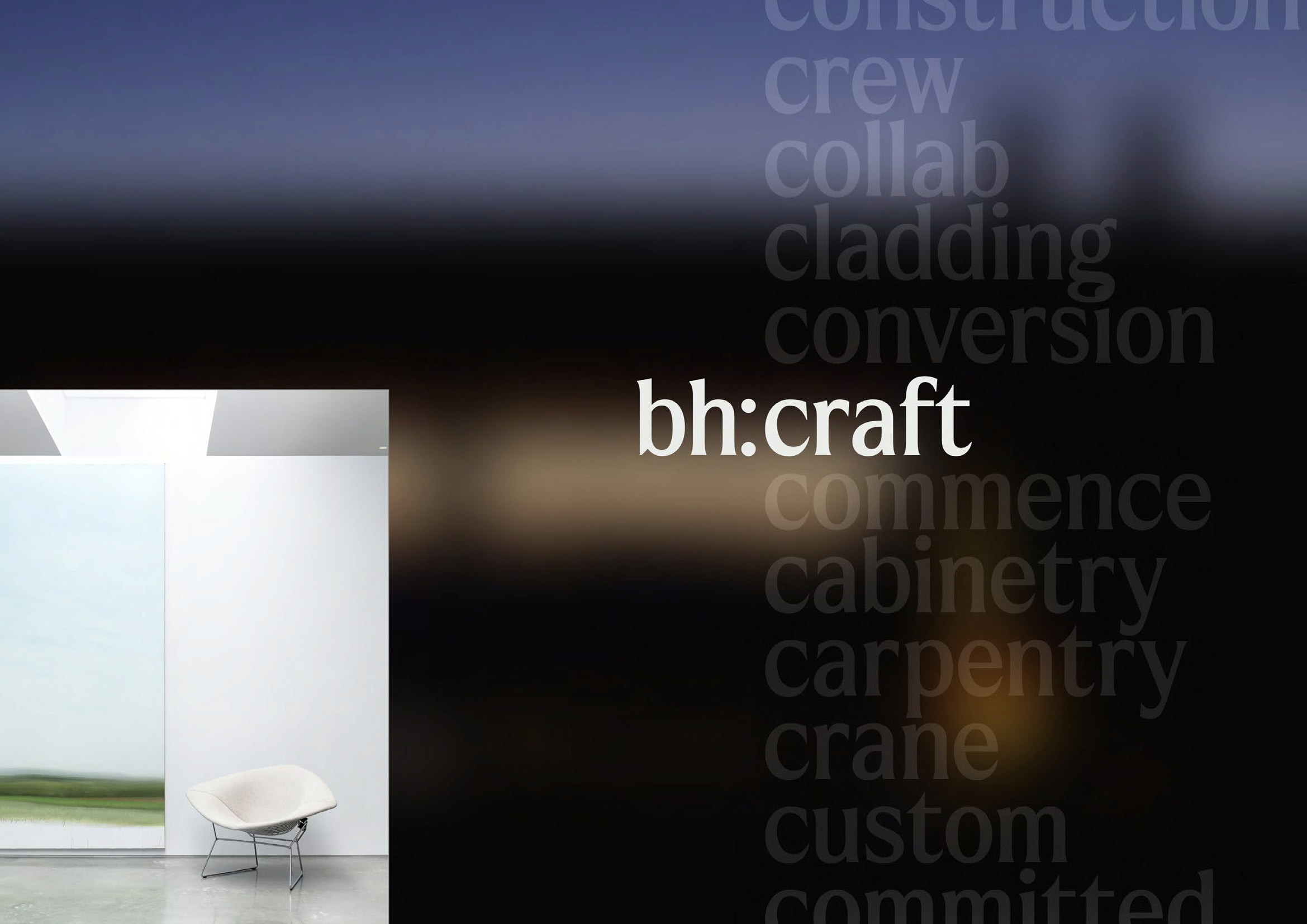
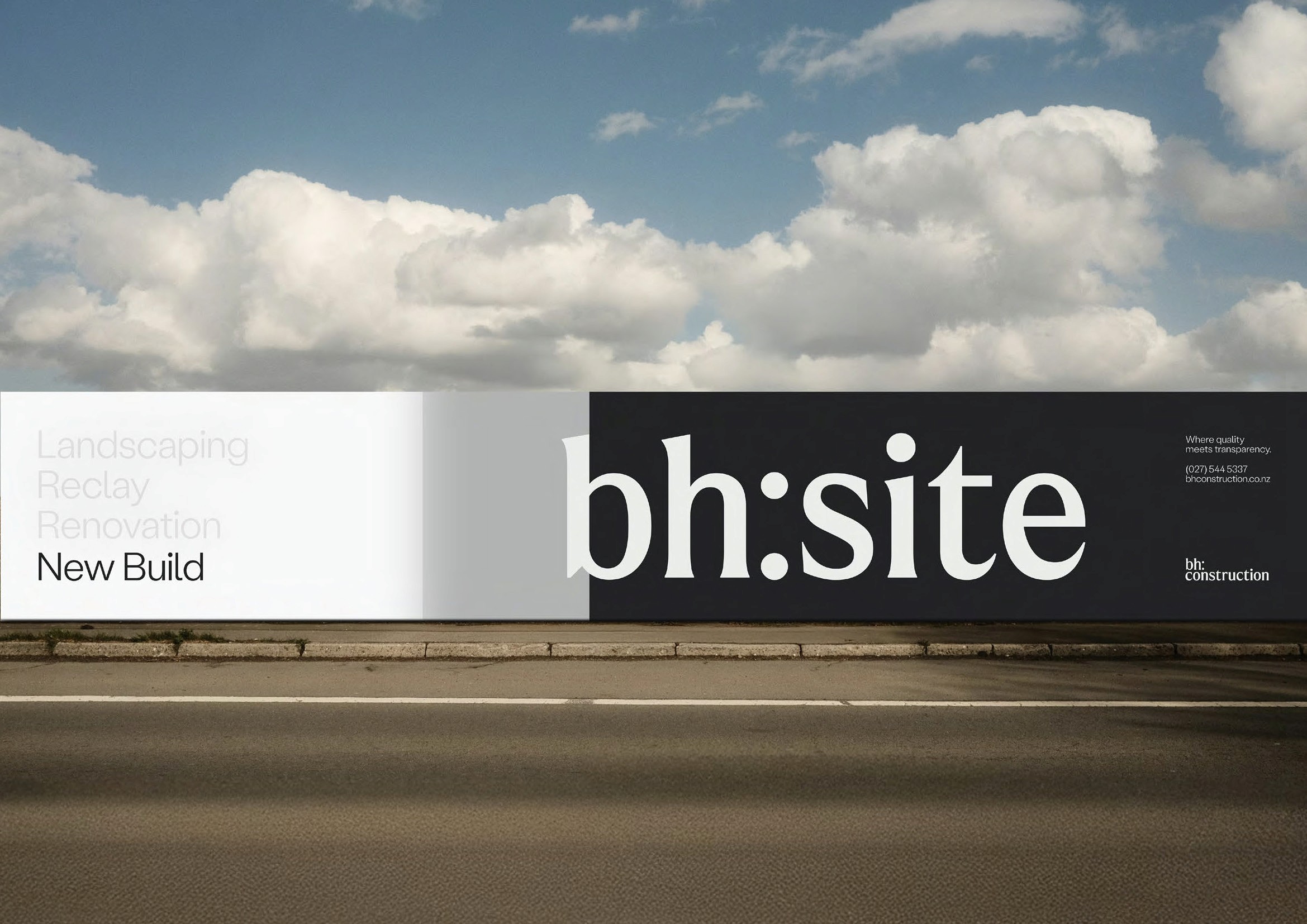
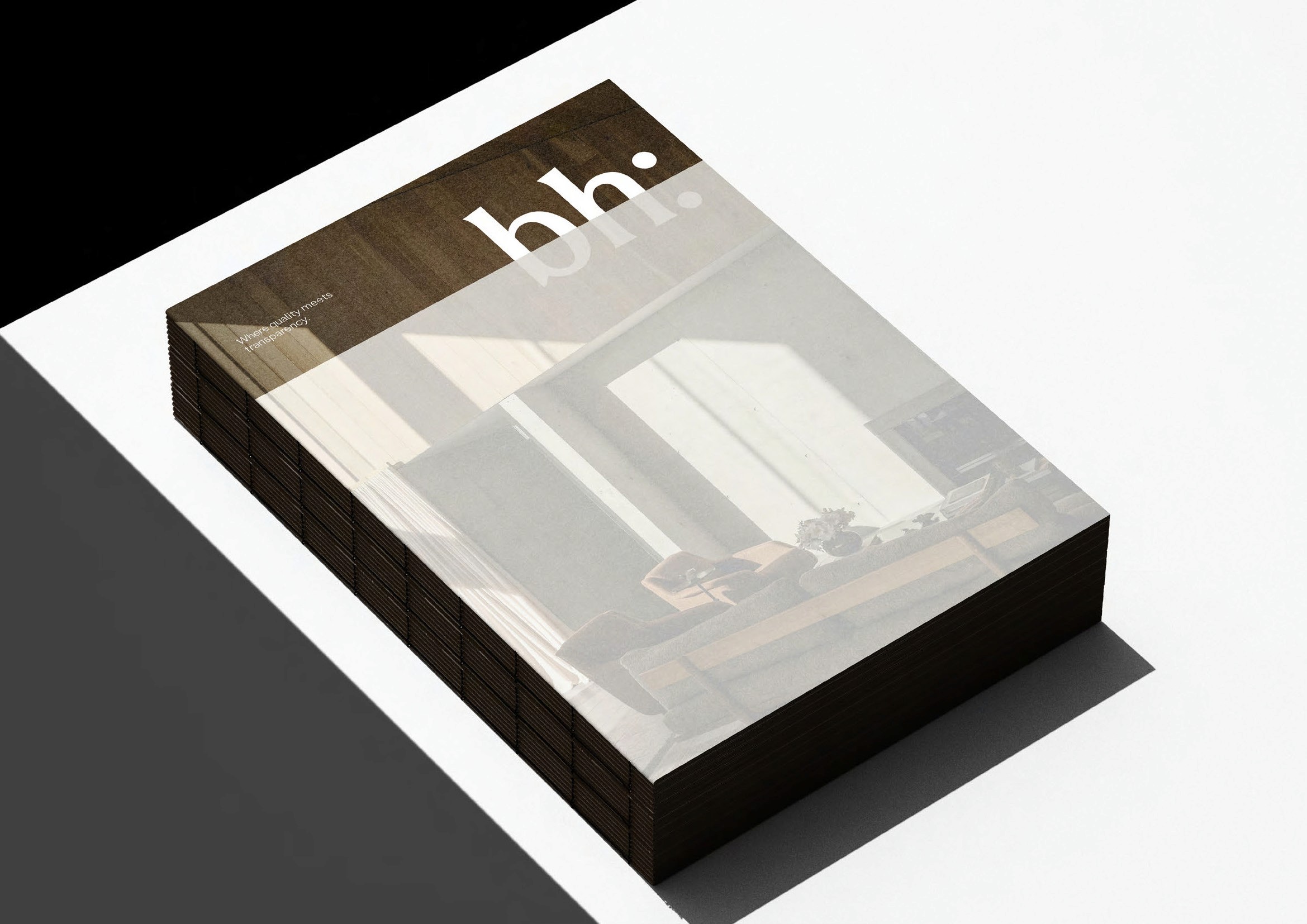
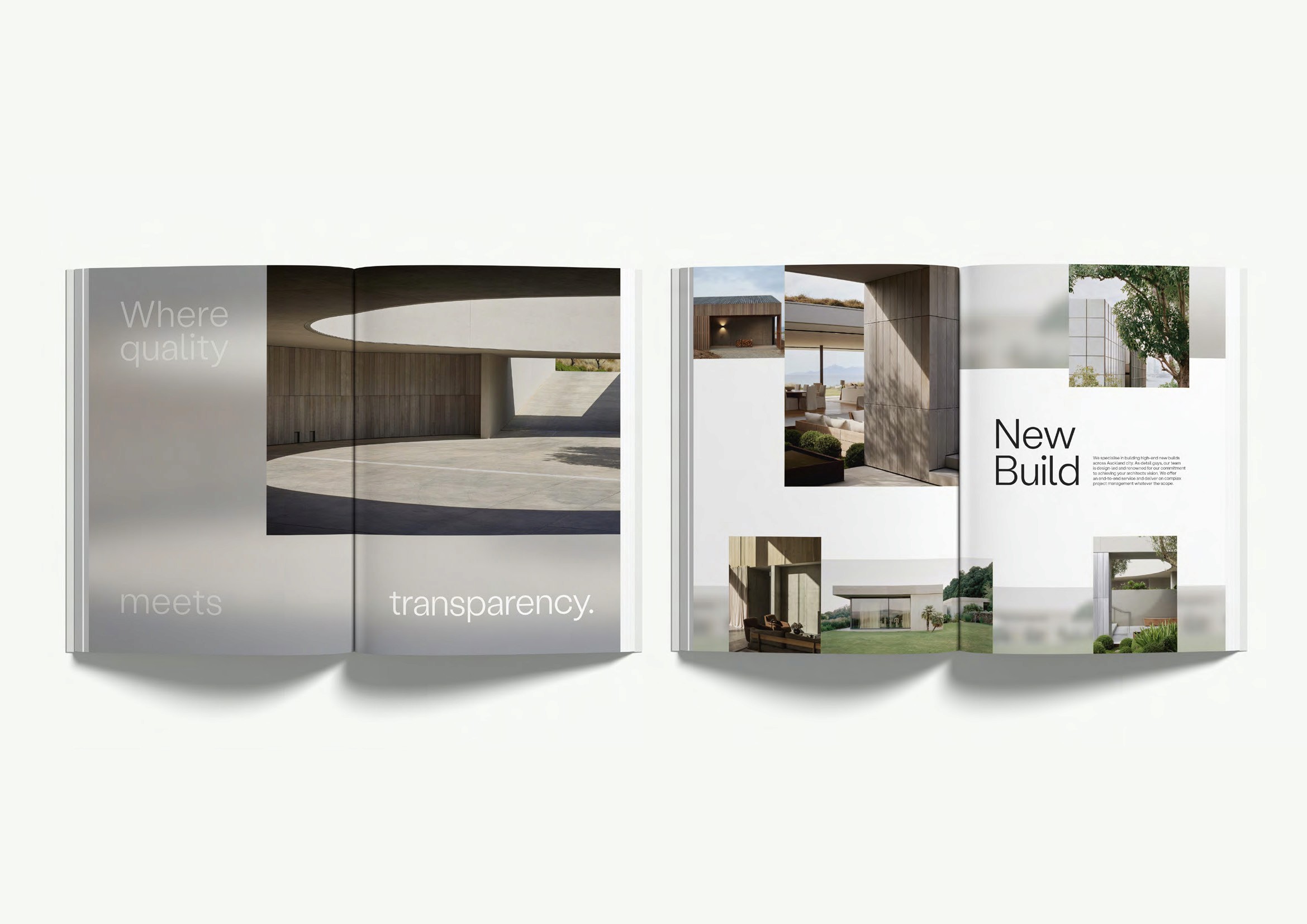
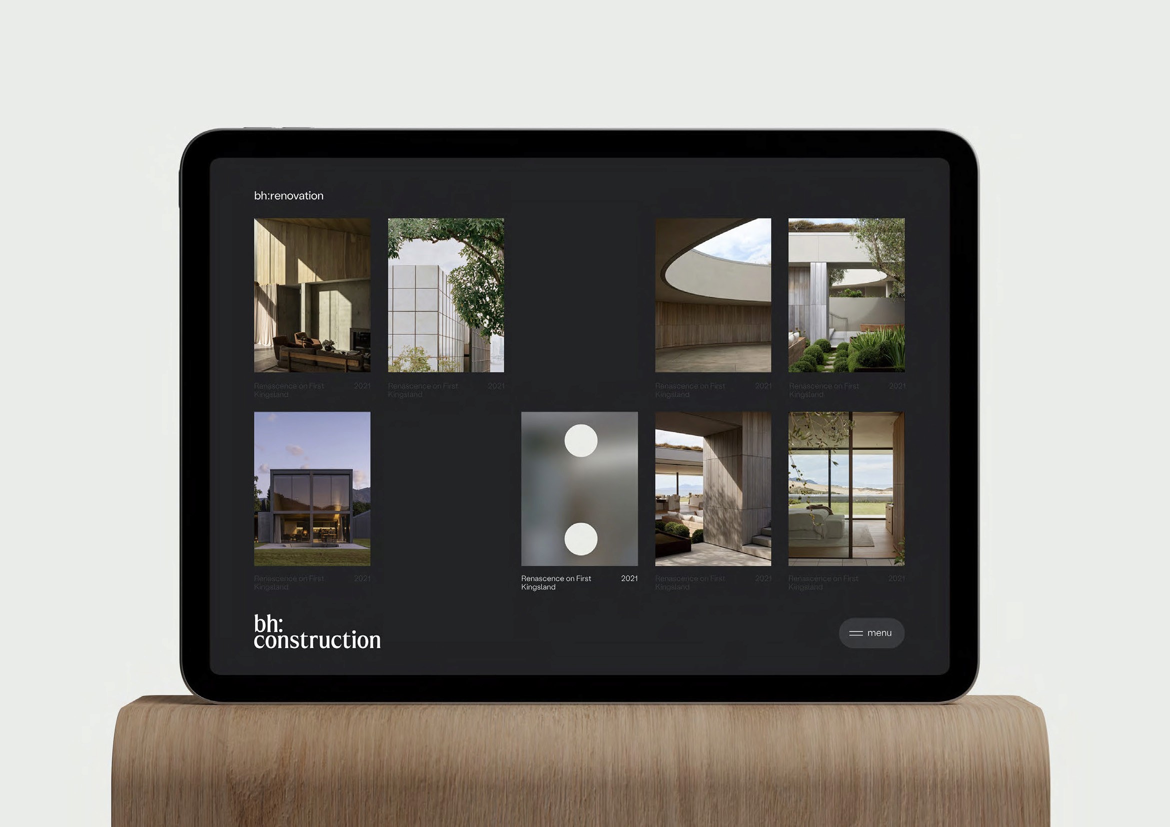
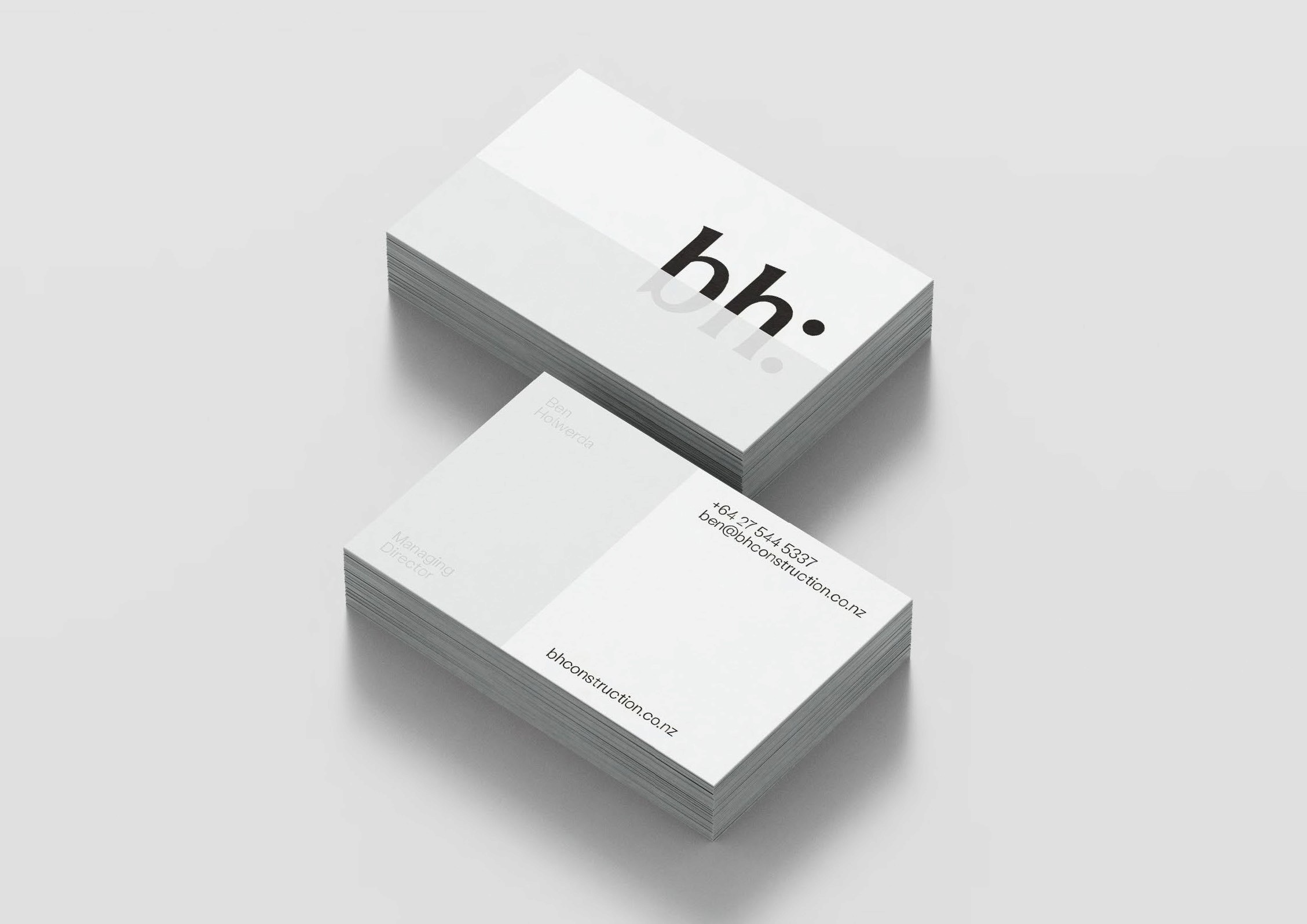
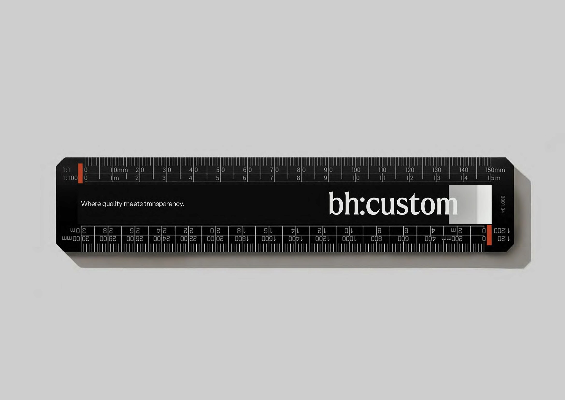
A single typographic intervention defines the mark: a colon introduced into the name — bh: — functioning simultaneously as visual anchor and conceptual signifier. From this device, a cohesive communication system extends across every touchpoint. A restrained palette and considered typography articulate precision without statement — a timeless identity where transparency and quality are inseparable.