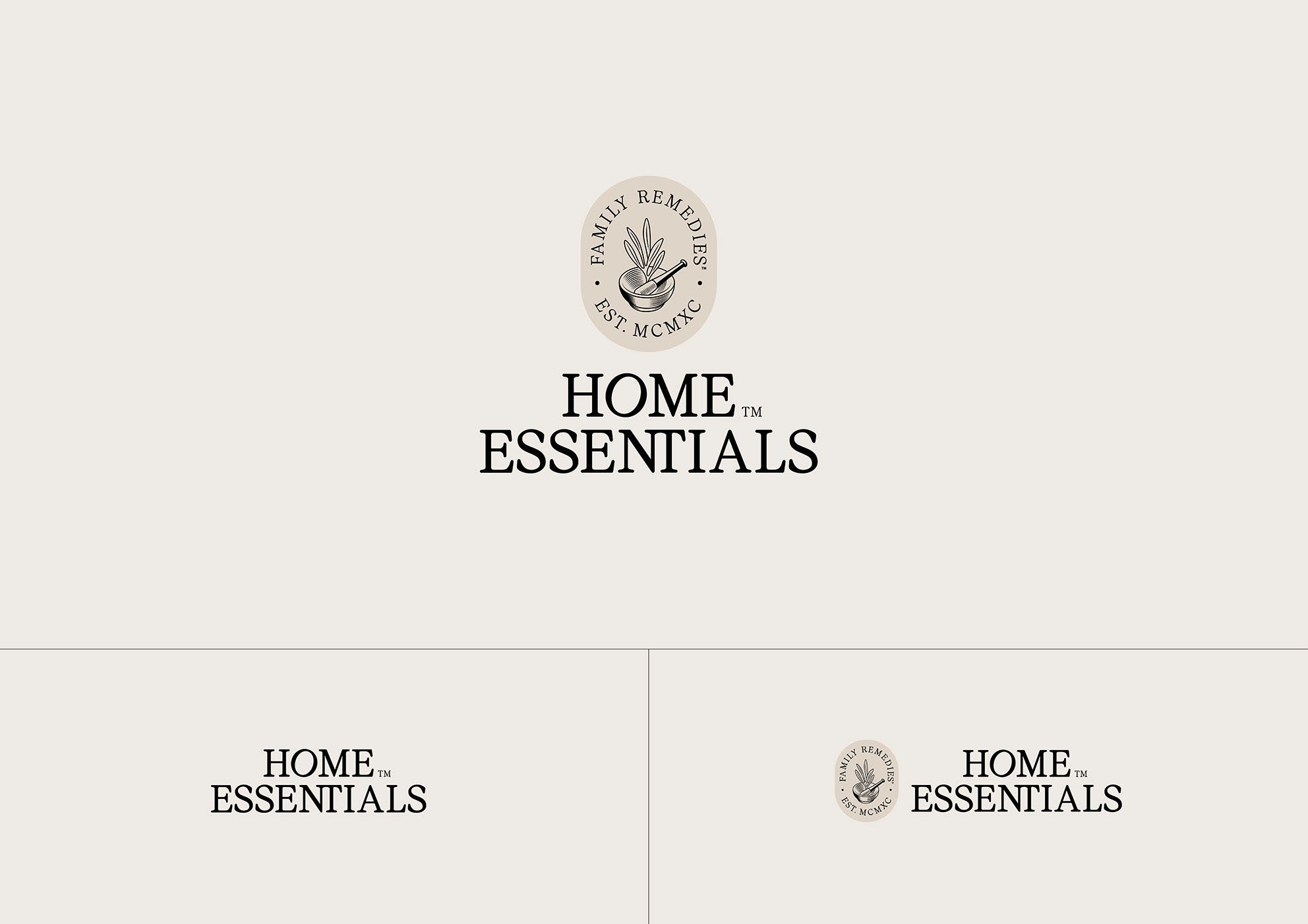
Home Essentials
Studio
Redfire
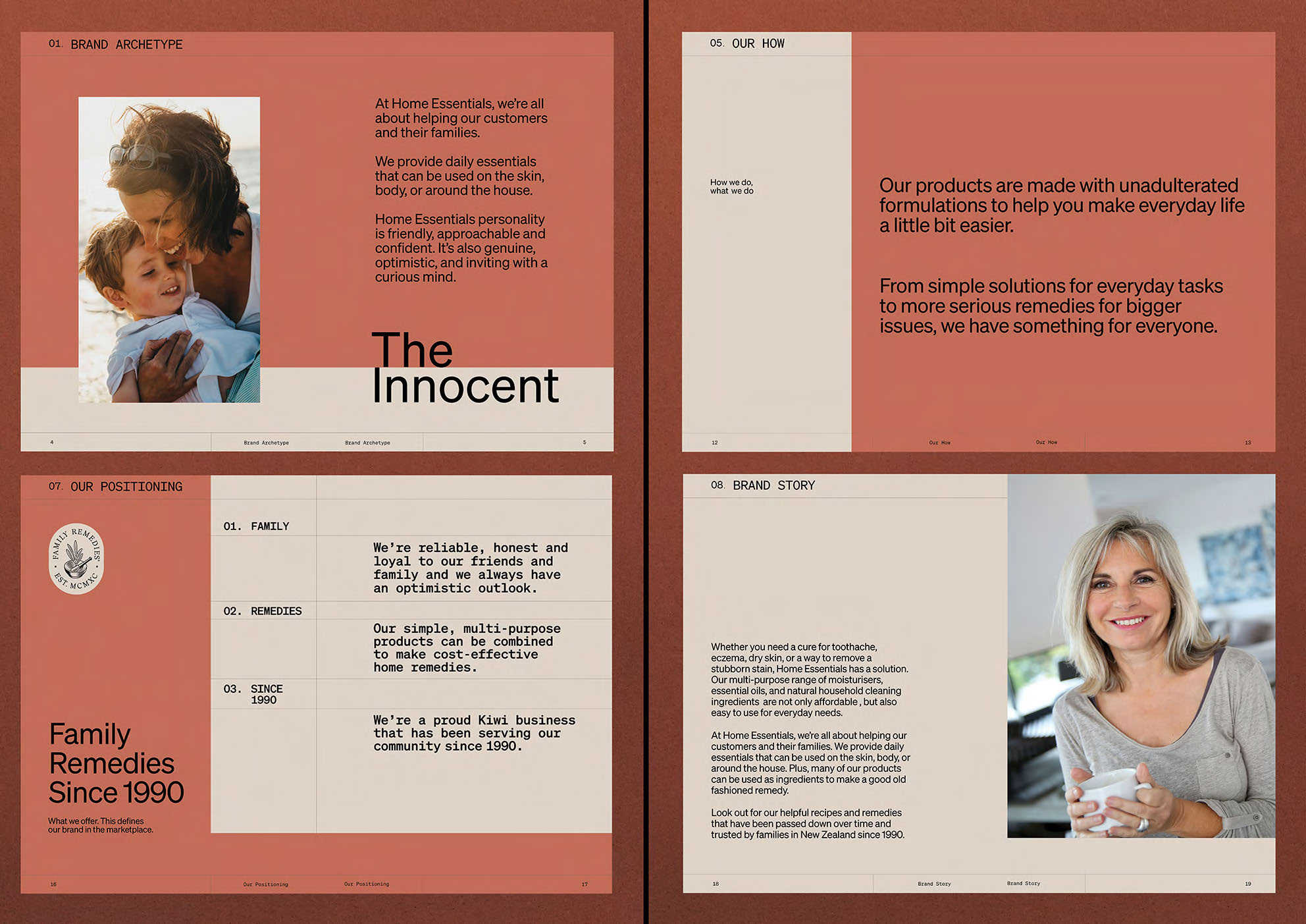
Role
Brand Identity, Brand System, Packaging Design, Digital Marketing


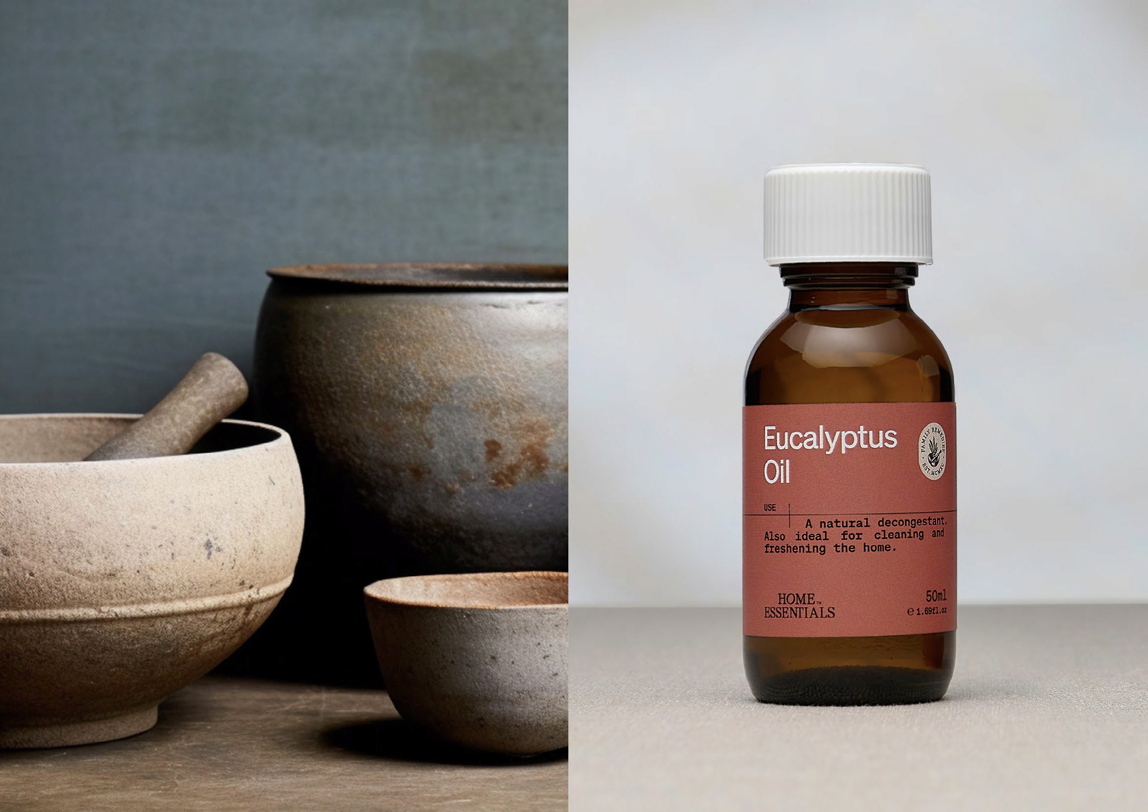


Challenge
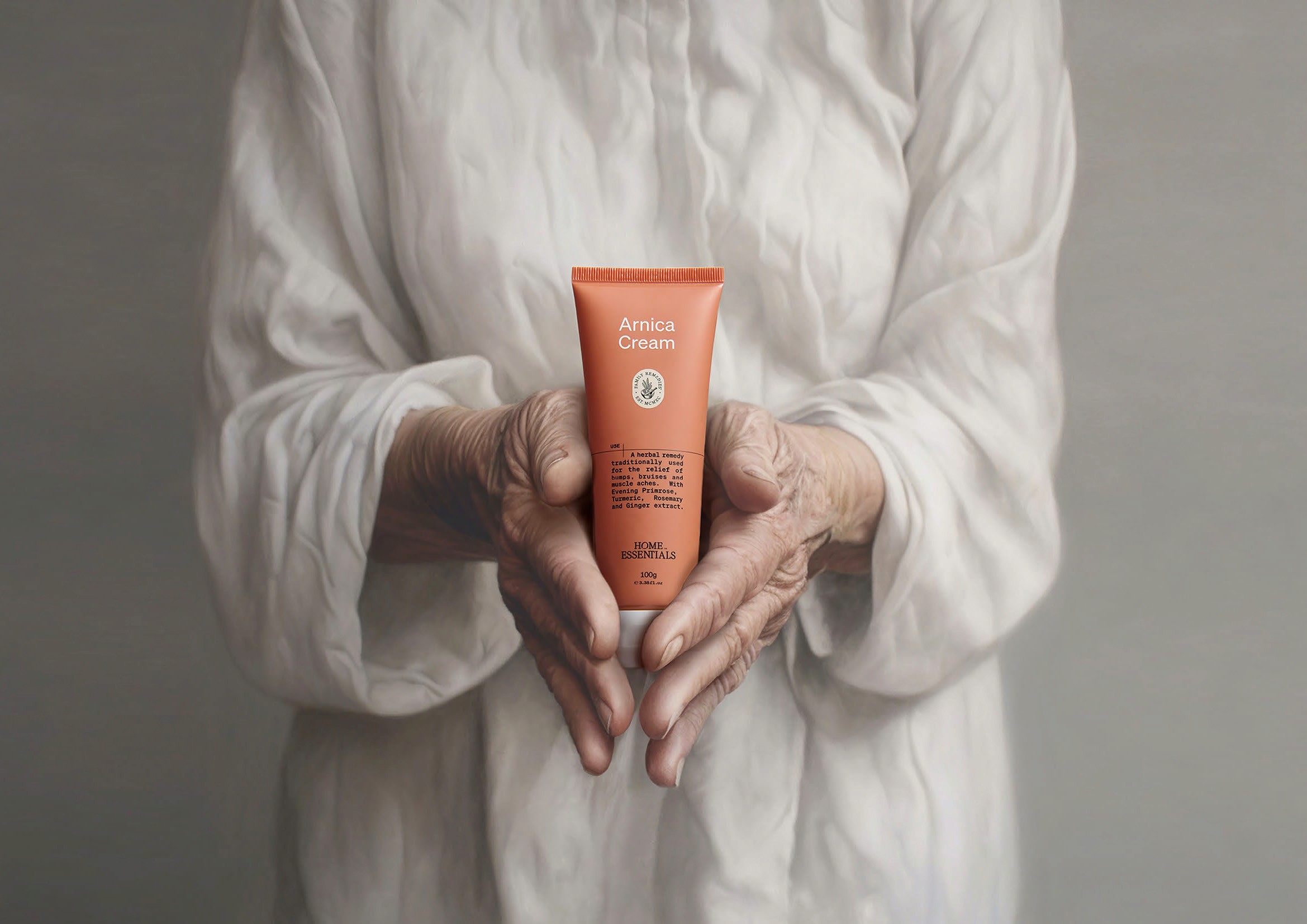
Refresh a 30-year-old household staple without alienating the loyal customer base that had grown up with it — simplifying a fragmented visual system whilst preserving the trusted, familiar qualities that made Home Essentials a staple in New Zealand homes.
Solution
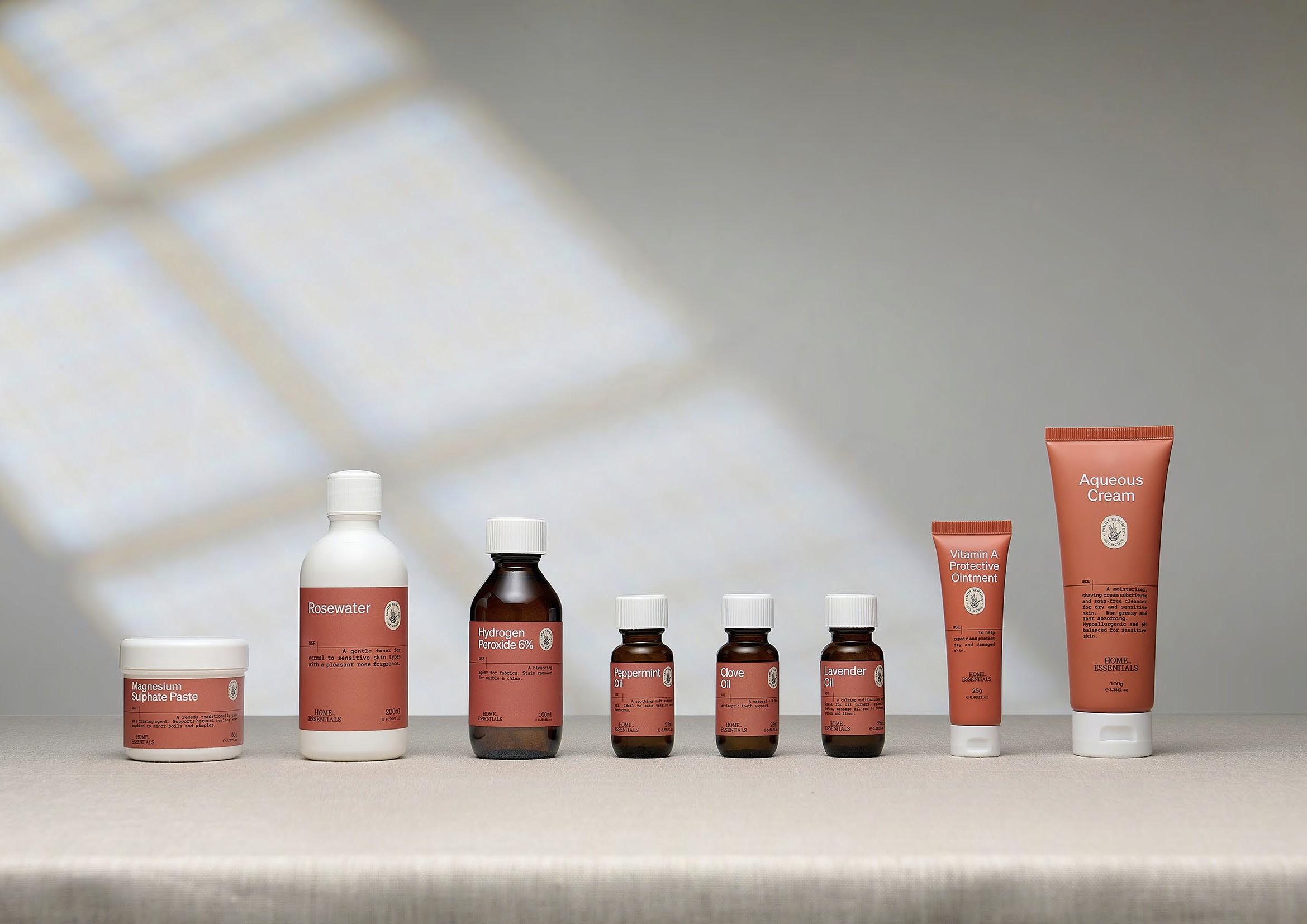
Multi-coloured packaging replaced with a streamlined colour system of earthy tones combined with cream and black — unique, timeless, and instantly recognisable on shelf. Colour blocking and layout mirroring the familiarity of a medical script reinforces the brand's remedy heritage. Typography that subtly reminds consumers of the trusted solutions Home Essentials has delivered for over 30 years. And it will always be grandma's favourite.